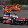
Tosh924 Posted January 3, 2007 Report Share Posted January 3, 2007 (edited) learning photoshop atm and this is my first proper attempt at a skin. good comments welcome (and bad) . before anyone starts i did not do this inspite of kruiz,s skin for bleach. he asked for 1 he got 1. it wouldnt have matterd what number was on the wing and who it was for. end off. thanks again to aub for render. cheers tosh [attachmentid=12551] Edited January 3, 2007 by tosh874 Link to comment Share on other sites More sharing options...
peter pooles son Posted January 3, 2007 Report Share Posted January 3, 2007 good job m8 looks nice Link to comment Share on other sites More sharing options...
Rikard Posted January 3, 2007 Report Share Posted January 3, 2007 nice skin Link to comment Share on other sites More sharing options...
erik Posted January 3, 2007 Report Share Posted January 3, 2007 Nice skin, but the render is cack. Link to comment Share on other sites More sharing options...
Sparky961 Posted January 3, 2007 Report Share Posted January 3, 2007 Nowt wrong with the render... Good skin and good render. Keep up the good work cheers sparky Link to comment Share on other sites More sharing options...
Aub Posted January 3, 2007 Report Share Posted January 3, 2007 Nice skin, but the render is cack. Link to comment Share on other sites More sharing options...
hotrod331 Posted January 3, 2007 Report Share Posted January 3, 2007 Nice skin, but the render is cack. why is it? aint 50 feet in the air like ures wheels look in proportion,looks fine to me,erik you seem to be asking for alot of stick on here! Link to comment Share on other sites More sharing options...
erik Posted January 3, 2007 Report Share Posted January 3, 2007 Nice skin, but the render is cack. why is it? aint 50 feet in the air like ures wheels look in proportion,looks fine to me,erik you seem to be asking for alot of stick on here! Aub criticizes my renders, so I felt it approriate that I give feedback on his. Link to comment Share on other sites More sharing options...
Dave488 Posted January 4, 2007 Report Share Posted January 4, 2007 Great skin Tosh and great render Aub.I cant see anything wrong with it anyway. But perhaps Erik could point out the bad bits for me coz i might be going blind i dunno. Link to comment Share on other sites More sharing options...
davey boy Posted January 4, 2007 Report Share Posted January 4, 2007 (edited) But perhaps Erik could point out the bad bits for me coz i might be going blind i dunno. yeah same here good skin and render, keep it up lads Edited January 4, 2007 by davey boy Link to comment Share on other sites More sharing options...
Dragon 428 Posted January 4, 2007 Report Share Posted January 4, 2007 I am trying to refrain myself from posting on threads like these but after reading Erik's reply I just have to. Erik, you say that the render is cack. It's easy to say that it is cack, but could you also point out what is cack about it? That way the guy who made the redner can try to improve it. This, as I am dead curious about what you think is wrong with the render. Look forward to youre answer. As for the skin. It looks good for a first proper attemt. The only thing I would change about it is not to use the bevel and embois tool settings. You can use it but when you overdo it, the signs become messy. You have to fiddle around a little bit to get the effect with it, that gives the signs a little extra. I see that a lot of people who are just starting to paint skins use this tool to their best effect. It is indeed a handy effect but as you'll come to grips with skinpainting, you'll see that a sign often looks better when the effect is not used. Good luck in any further efforts Dragon Link to comment Share on other sites More sharing options...
Marcy_Boi#133 Posted January 4, 2007 Report Share Posted January 4, 2007 I'm with Dragon on this one, whats up with the render Erik? Not big enough wheels? I'd also say instead of using the bevel tool, try creating the airbrushed effect yourself using the line tool and blur it. IMO it looks more realistic and is more satisfying as you haven't just clicked an effect un photoshop. When I get some spare time I'll update my skinpainting guide with some stuff on how to do airbrush effects and other little things in photoshop. Nice skin though, and nice render despite what the stupid jock says! Link to comment Share on other sites More sharing options...
erik Posted January 4, 2007 Report Share Posted January 4, 2007 You lot reckon I should explain why the render is cack? Why? When all I got from him was the following.. 3. your renders look even worse So, its okay for him to criticize my renders with no explanation, but I can't do the same thing? Link to comment Share on other sites More sharing options...
Dragon 428 Posted January 4, 2007 Report Share Posted January 4, 2007 You lot reckon I should explain why the render is cack? Yes Why? Because we ask you politely. Plus, you have an opinion and we are very interested what kind of back up your opinion has. We are not saying that something is ok, we just ask you a question. We are not talking about that other person you are referring to. Link to comment Share on other sites More sharing options...
erik Posted January 4, 2007 Report Share Posted January 4, 2007 You lot reckon I should explain why the render is cack? Yes Why? Because we ask you politely. Plus, you have an opinion and we are very interested what kind of back up your opinion has. We are not saying that something is ok, we just ask you a question. We are not talking about that other person you are referring to. What I don't get is why I have to back up my opinion, but he doesn't? Link to comment Share on other sites More sharing options...
Nemesis239 Posted January 4, 2007 Report Share Posted January 4, 2007 When is someone going to put this Helmet! out of his misery?! Link to comment Share on other sites More sharing options...
mcrew Posted January 4, 2007 Report Share Posted January 4, 2007 When is someone going to put this Helmet! out of his misery?! Link to comment Share on other sites More sharing options...
Dragon 428 Posted January 4, 2007 Report Share Posted January 4, 2007 What I don't get is why I have to back up my opinion, but he doesn't? Because we are asking YOU to back it up. We don't ask anyone else to back his opinion up, thats why Link to comment Share on other sites More sharing options...
H33Racing Posted January 4, 2007 Report Share Posted January 4, 2007 lol i think this is gonna be one of these long long discussions.. Cheers Mark Link to comment Share on other sites More sharing options...
Kruiz 136 Posted January 4, 2007 Report Share Posted January 4, 2007 lol i think this is gonna be one of these long long discussions.. Cheers Mark I'm not taking part in this one lol Ive learnt my lesson Link to comment Share on other sites More sharing options...
Tosh924 Posted January 4, 2007 Author Report Share Posted January 4, 2007 As for the skin. It looks good for a first proper attemt. The only thing I would change about it is not to use the bevel and embois tool settings. You can use it but when you overdo it, the signs become messy. You have to fiddle around a little bit to get the effect with it, that gives the signs a little extra. I see that a lot of people who are just starting to paint skins use this tool to their best effect. It is indeed a handy effect but as you'll come to grips with skinpainting, you'll see that a sign often looks better when the effect is not used. Good luck in any further efforts Dragon yup i see your point dragon, aub also told me about that as well that their maybe to much bevel and embois. maybe got carried away as i wanted it to look good. i never learned to us the airbrush also so maybe give that a try next time..... thanks for your comments lads.....appreciate that Link to comment Share on other sites More sharing options...
Tosh924 Posted January 4, 2007 Author Report Share Posted January 4, 2007 heres how it looks on the game from the other side..think using the bevel and embois to much was trying to get it to look real like how u would see signs on a real f2. but as some of you have pointed out it doesnt need to be.... [attachmentid=12581] Link to comment Share on other sites More sharing options...
grant Posted January 4, 2007 Report Share Posted January 4, 2007 Nice skin m8 Link to comment Share on other sites More sharing options...
Haadee#525 Posted January 4, 2007 Report Share Posted January 4, 2007 i dont know what is wrong with renders Great job keep up the good stuff Link to comment Share on other sites More sharing options...


Recommended Posts